Apple iOS 8.1 Vs Google Android 5.0 Lollipop – Visual Comparison [Screenshots]
iOS 8.1 has been released, with Google no later finally announcing the release of the much awaitedAndroid 5.0 Lollipop OS. The two giants of the smartphone platform industry continue to be locked in one of the fiercest OS battles of the modern age. Google has made some exceptional changes with Android 5.0, with Apple claiming the same for iOS 8.1. But how do they actually stack up against each other?
Earlier, we compared iOS 8 beta and Android L – as it was known back then. However, iOS 8 wasn’t exactly the most prolific release from Apple, and Google’s Android L didn’t even have a version number, let alone a name to it.
[post_ad]
[post_ad]
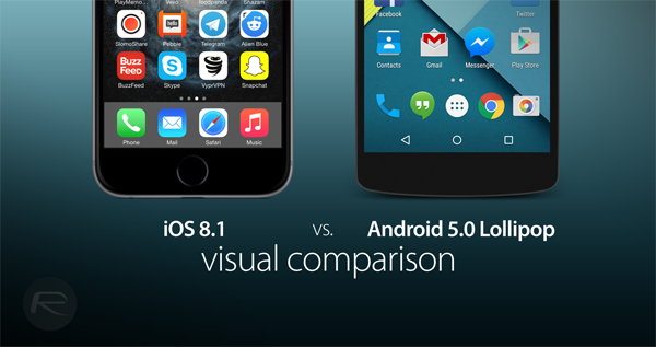
While features and functions do play a pivotal role in shaping a consumer’s choice, more than often it is the visual element which determines the final choice. Android, with its Project Butter for Jelly Bean and KitKat, brought in the much needed speed and fluidity to the OS, and since then has improved that to match iOS. Lollipop adds some physics-based fluid animations, so exactly how far improved is the OS’s overall fluidity compared to iOS can only be determined once the final consumer release is out.
iOS 8.1 continues on with the same design language we saw with the introduction of iOS 7, whereas the Material Design in Android 5.0 Lollipop is the first major design overhaul since Android 4.0 Ice Cream Sandwich was released. Some believe this Material Design was pitched in a bid to catch up to the modern design language that Apple introduced with iOS 7 and has retained in iOS 8.x as well. Apple sticks to its clear glass look in iOS 8.1, while Android 5.0 Lollipop brings in real-time generated shadows for elements within the interface. Strikingly poles apart – visually and features wise – both bode a flat look for the interface and icons, and employ a more simplistic design philosophy.
The visual comparison of the two platforms – barring the features – can actually help in determining for yourself if and where the two platforms have borrowed visual elements from one another.
[post_ad]
[post_ad]
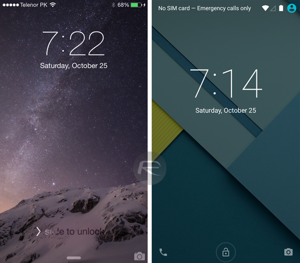
iOS 8.1 lock screen (left) vs. Android 5.0 Lollipop lock screen (right)
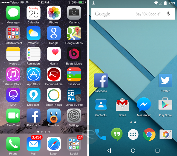
iOS 8.1 home screen (left) vs. Android 5.0 Lollipop home screen (right)
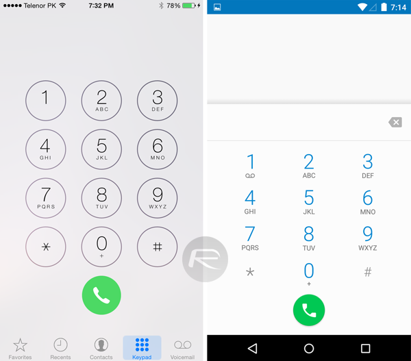
[post_ad]
iOS 8.1 Phone dialer (left) vs. Android 5.0 Lollipop Phone dialer (right)
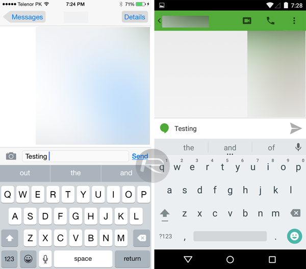
iOS 8.1 keyboard (left) vs. Android 5.0 Lollipop keyboard (right)
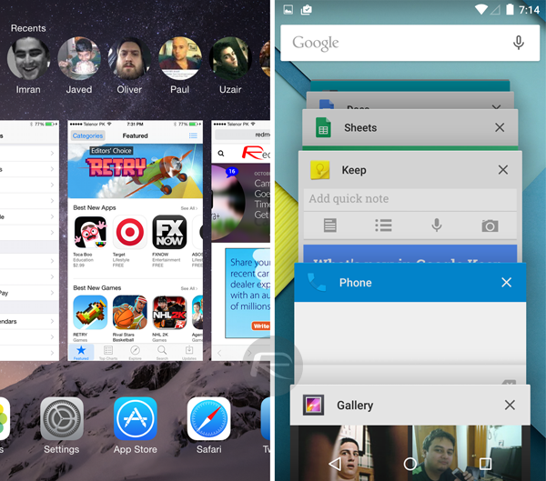
iOS 8.1 multitasking (left) vs. Android 5.0 Lollipop multitasking (right)
[post_ad]
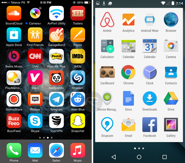
iOS 8.1 home screen apps (left) vs. Android 5.0 Lollipop app drawer (right)
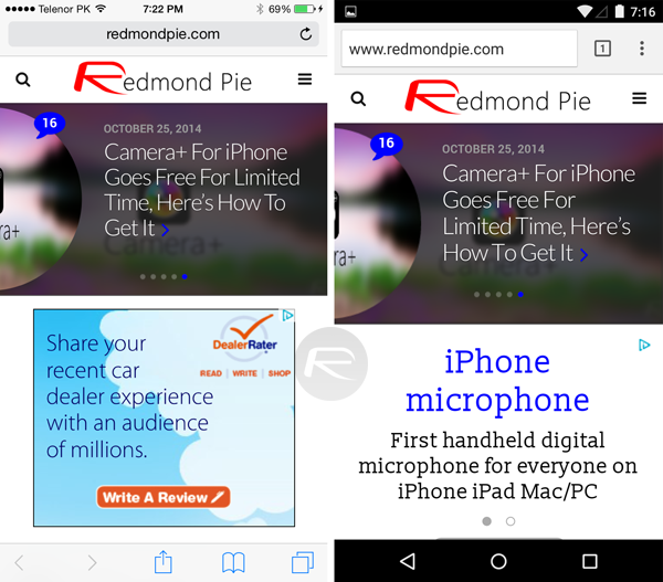
iOS 8.1 Safari (left) vs. Android 5.0 Lollipop Chrome (right)
[post_ad]
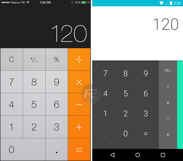
iOS 8.1 Calculator (left) vs. Android 5.0 Lollipop Calculator (right)
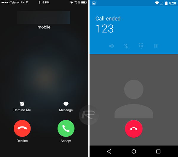
iOS 8.1 Phone app (left) vs. Android 5.0 Lollipop Phone app (right)
[post_ad]
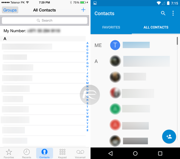
iOS 8.1 Contacts app (left) vs. Android 5.0 Lollipop Contacts app (right)
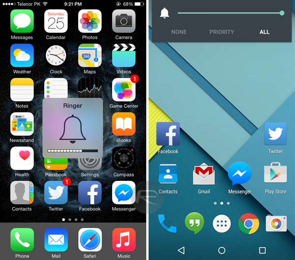
iOS 8.1 Volume HUD (left) vs. Android 5.0 Lollipop volume controls (right)
[post_ad]
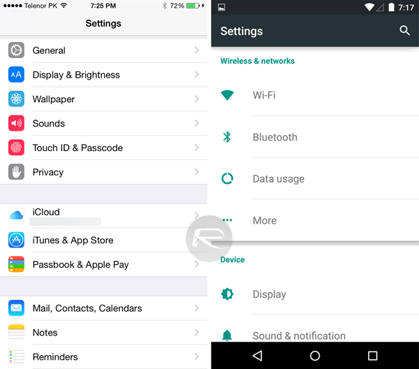
iOS 8.1 Settings app (left) vs. Android 5.0 Lollipop Settings app (right)
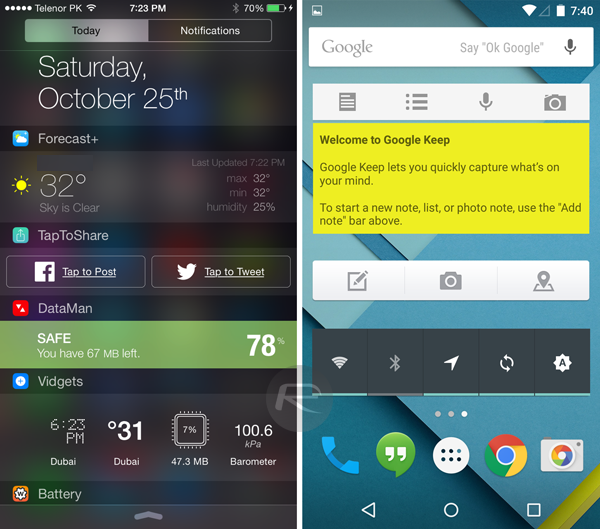
iOS 8.1 Notification Center widgets (left) vs. Android 5.0 Lollipop home screen widgets (right)
[post_ad]
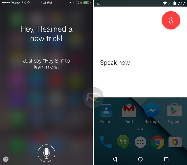
iOS 8.1 Siri (left) vs. Android 5.0 Lollipop Google Now Search (right)
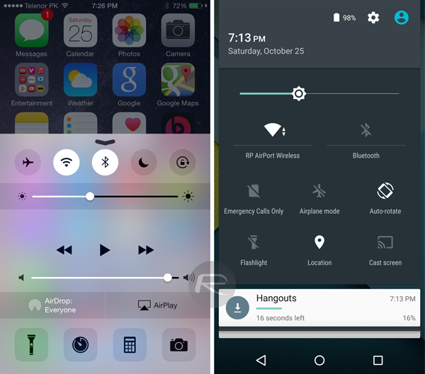
iOS 8.1 Control Center (left) vs. Android 5.0 Lollipop notification drawer system toggles (right)
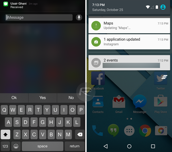
iOS 8.1 home screen notifications (left) vs. Android 5.0 Lollipop home screen notifications (right)
[post_ad]
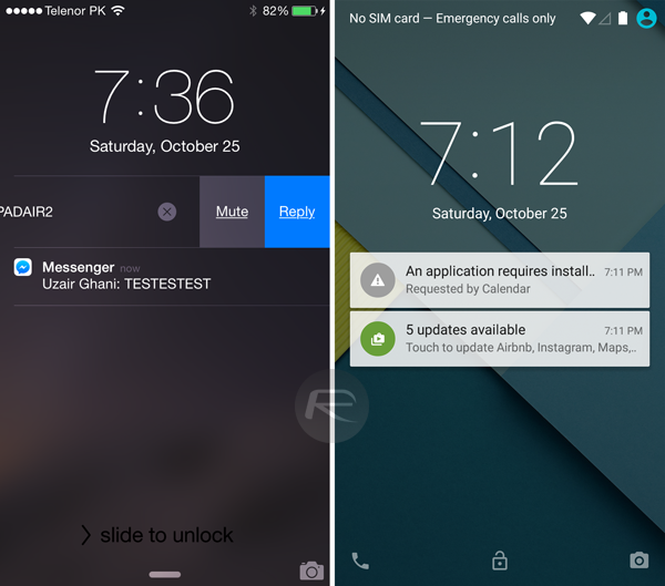
iOS 8.1 lock screen notifications (left) vs. Android 5.0 Lollipop lock screen notifications (right)
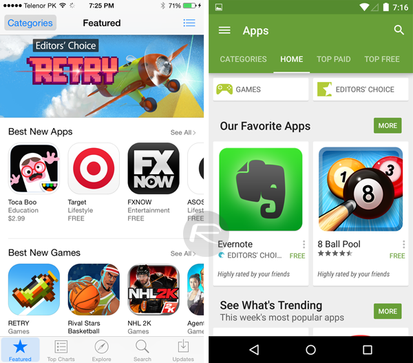
iOS 8.1 App Store (left) vs. Android 5.0 Lollipop Google Play Store (right)
[post_ad]
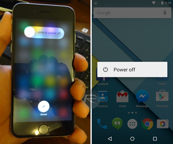
iOS 8.1 power off screen (left) vs. Android 5.0 Lollipop power off screen (right)
Apple iOS 8.1 Vs Google Android 5.0 Lollipop – Visual Comparison [Screenshots]
![]() Reviewed by Vijitashv
on
12:12 pm
Rating:
Reviewed by Vijitashv
on
12:12 pm
Rating:

No comments: